First off, this is not going to be an all-inclusive series about everything you can do with Photoshop or GIMP. This first post is going to cover certain basic aspects of digital imagery. Whether you are working on some new promotional pics or just cleaning up some to post on Facebook, hopefully you’ll learn something useful from this short article.
What are color modes?
Everyone should be familiar with the RGB, or red-green-blue, color mode. After all, at some point you’ve used either a computer or television that used an RGB input or screen. This is simply a method of displaying a large array of colors by tweaking the amount of the red, green, and blue shades used. It is based off the Young–Helmholtz theory of trichromatic color vision which relates to the receptors in our eyes and the way those receptors detect colors.
Another color mode that typically only people involved in printing deal with, is the CMYK color mode. CMYK is comprised of four colors and works by partially or completely masking colors on a lighter background, typically white. The colors are cyan, magenta, yellow, and the key color (black). The principal difference between RGB and CMYK is the way the colors are combined to produce different colors. RGB is an additive mode where white is the combination of all of the primary colors and black is the absence of color. CMYK is a subtractive mode where white is the default from the absence of color, and black becomes the combination of the primary colors.
Great, so how does this apply to what we as musicians do? Typically speaking it doesn’t apply to what we do as musicians. This applies to how we visually present things, such as pictures, videos, printing merchandise, etc…. It is important to use the correct mode so that the end result looks the way it did when you were designing it. The easiest, most simplistic approach, is to just use RGB when it will be displayed on a screen, and use CMYK when the end product is something that will be printed.
What about color profiles?
A color profile is typically a file that describes how a given printer/ink/paper combination combine to accurately display colors. However, color profiles also affect on how your pictures and designs display on the web. The best approach is to talk to your printing service about what profile will be needed for their printers. Then try to get that profile and use it during your part of the design process so you don’t have conversion problems later. In regards to displaying an image on the web, most browsers use the sRGB color profile. The problem here comes from the fact that the original image will have an embedded color profile depending on how you created it. If it is a picture from a camera, then it will probably have the color profile the camera manufacturer chose to set. Easiest thing to do is convert the image or design to the sRGB profile when you start your editing work.
What is a histogram?
A histogram is NOT something to do with historical information. Simply put, a histogram is a graph displaying the distribution of tones in the image. Okay, so how do you use it?
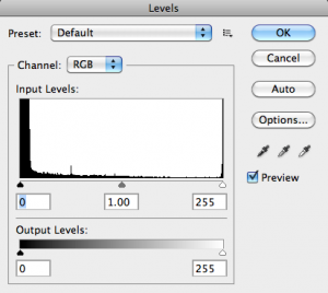
In Photoshop, you have two ways to see and adjust around the histogram. The primary method is through the Levels dialog, found under Image>Adjustments. This will show you the histogram for the image you’re viewing. The horizontal axis displays the distribution of dark to light tones in the image, whereas the vertical axis shows the amount in each value range. In the example above, you can see this is a dark image due to the heavy distribution of dark tones to the left. This means to fix this we need to lighten the image. You can do this through the Levels dialog directly; my recommendation is to shift the middle pointer to get the lightening you need. However, you can also view and adjust around the histogram in the Curves dialog box as well. In both of these you can adjust all color channels together or adjust each individually, as chosen by the drop-down menu. Of course a good photographer will provide you with a balanced image that will need little adjusting.
What is this RAW stuff I hear about?
Any image you view within your web browser is compressed in some way. The pictures taken by cameras are processed and compressed by default on the camera to save space and allow for more pictures. For the typical consumer, this works great. Even for most band photos this is fine as long as you use a higher quality setting on the camera. Just remember the better the quality, the bigger the file size of each picture. A RAW image file is a minimally processed image taken by a camera or scanner. It is called RAW because it is as close to a raw unprocessed picture as you’ll get. This is overkill for when you are taking pictures of a live performance as you will typically take a large volume of pictures and intend to post them someplace online. In the case of promotional or to-be-printed photos, you’ll want to use RAW as it will provide you the most room to work with, but will also take up the most disk space.
So how do I get a good picture?
If you’re wanting good live photos, your best bet is to make sure you have decent lighting on stage and put on a great visual performance. Of course, since you are performing you will have to get someone else to take the pictures for you. Hopefully they will know a decent amount regarding photography, but if not, then you will want to educate them or find someone who does know about photography. The reason I push this is that I have seen, and have had taken of myself, too many pictures where the Automatic settings were used, which resulted in washed out pictures due to the flash and other camera settings. This leaves very little room to work with and will not give you pictures like those you see of these well-known bands posting online.
A quick test for your photographer, is ask if they feel the need to change the f-stop or shutter speed due to the lighting levels around the stage. If they give you a blank stare, then find someone else!
Quick Recap
So far we’ve covered a bunch of information regarding some basics of image file types and color display models. I expect some heads are still being scratched right now and that’s fine. There’s a lot involved with being a musician that extends beyond just playing music. Understanding your visual presentation is a small part of it. A simple way to approach this is:
-
Decide what media you are going to be using.
-
Anything using a photo will require you to first approach the aspects of obtaining a great photo to start with.
-
If you need high quality professional looking photos, then hire a knowledgeable photographer and get them to use and provide you with the RAW image files.
-
-
If you are targeting digital displays, the make sure you use RGB color mode during your work.
-
Remember to convert to sRGB if you are going to upload to websites to ensure browser compatibility.
-
If this is going to be sent to a print shop, the use the CMYK color mode and check with the shop to see if there is any special color profile they use for their equipment that may change the colors of your design as well as any cost difference based around how many colors are used.
-
Some Quick Tricks for Promo Photos
For my example, I’m going to use this old promo pic from a previous band. This photo was taken using the RAW format. Initially we can see the backdrop, and it seems a bit dark overall. This is from the amount of light that was used during the photoshoot.
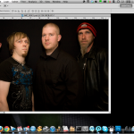
First thing we’re going to do is to go to the Layer menu and add a new Adjustment Layer. A Levels adjustment layer in particular. Recall this is where we can adjust directly around the histogram.
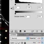
As you can see there are more dark/shadow tones in the picture by far. A quick shift to the left on the Midtone slider, and we have a brighter picture. Now however, we can really see that backdrop.
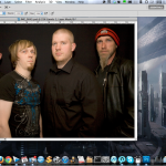
Now let’s try a trick that I picked up a while back to help create that “professional photo” type look. First select your background layer and duplicate it. You can do this with Cmd+J on a Mac and Ctrl+J on Windows. Select your Background copy and set the layer mode to Soft Light. Adjust the Opacity to whatever you like. I set mine to 70% as it keeps the brightness just enough while darkening the backdrop to where you can’t see the details.
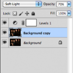

Now it looks a lot better already. You can play around more with this layer to create a “glow” style effect by applying a Gaussian Blur to it. Try different settings for the Radius. I usually keep mine lower at around three or less, but adjust to suit your preference and how it affects your picture. In darker pictures especially you may find that less is more, however a larger radius can be a great way to create an interesting glow effect in your brighter pictures. The main thing is to experiment with it to see what works best on the picture.
Well, that’s it for this first part. For the next part I’m trying out some different techniques for handling background removal and will be showing you the ones that seem to work best. You can send any questions or comments through the form on my Contact page.